Industry
What makes a luxury listing feel inhabited
The four things that decide whether a listing looks inhabited or merely documented.
12 April 2026 · 9 min read
A large apartment sells the same way as a small flat: photography first, copy second, viewing third. What changes is the bar.
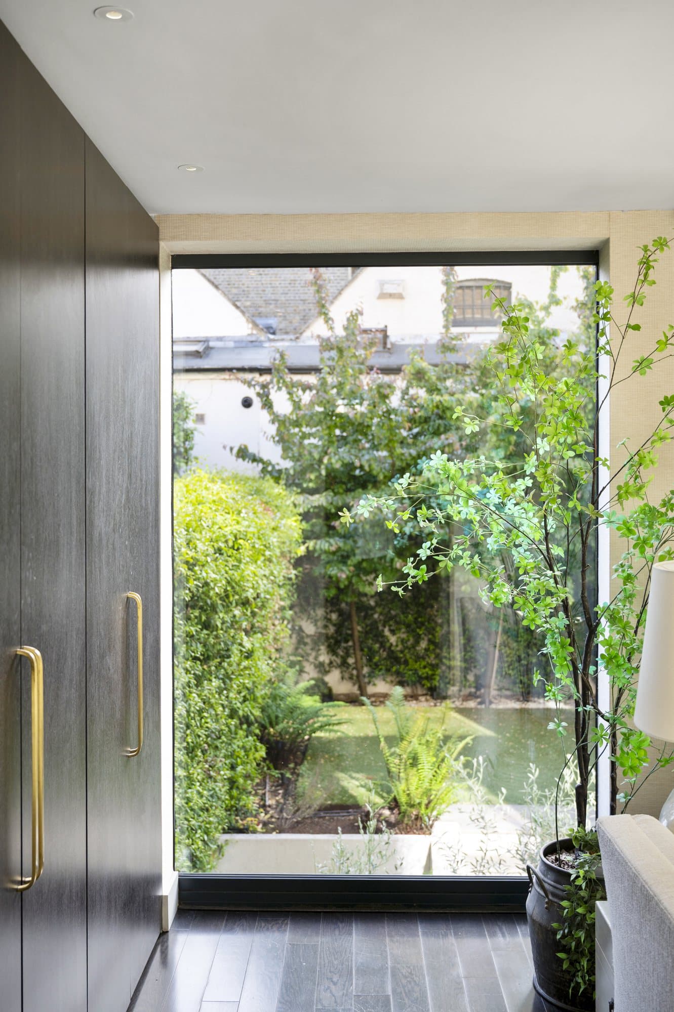
For prime listings, the buyer is not comparing your photos to the next listing on Rightmove. They are comparing them, often unconsciously, to the photography in *Architectural Digest* and *Wallpaper* and the Sunday colour supplements they read with their coffee. That is the visual standard your listing is competing against. If your photos look like estate-agent photography, the listing is already dead.
Below are four levers worth considering on a shoot at this level.
1. The hero image is a cinema poster, not a documentation shot
Documentation photography records the room. Cinema photography frames a story. The lever is composition: low camera angle (around 1.2 m), long focal length (35–50 mm equivalent on full-frame), one strongly lit element, deep negative space.
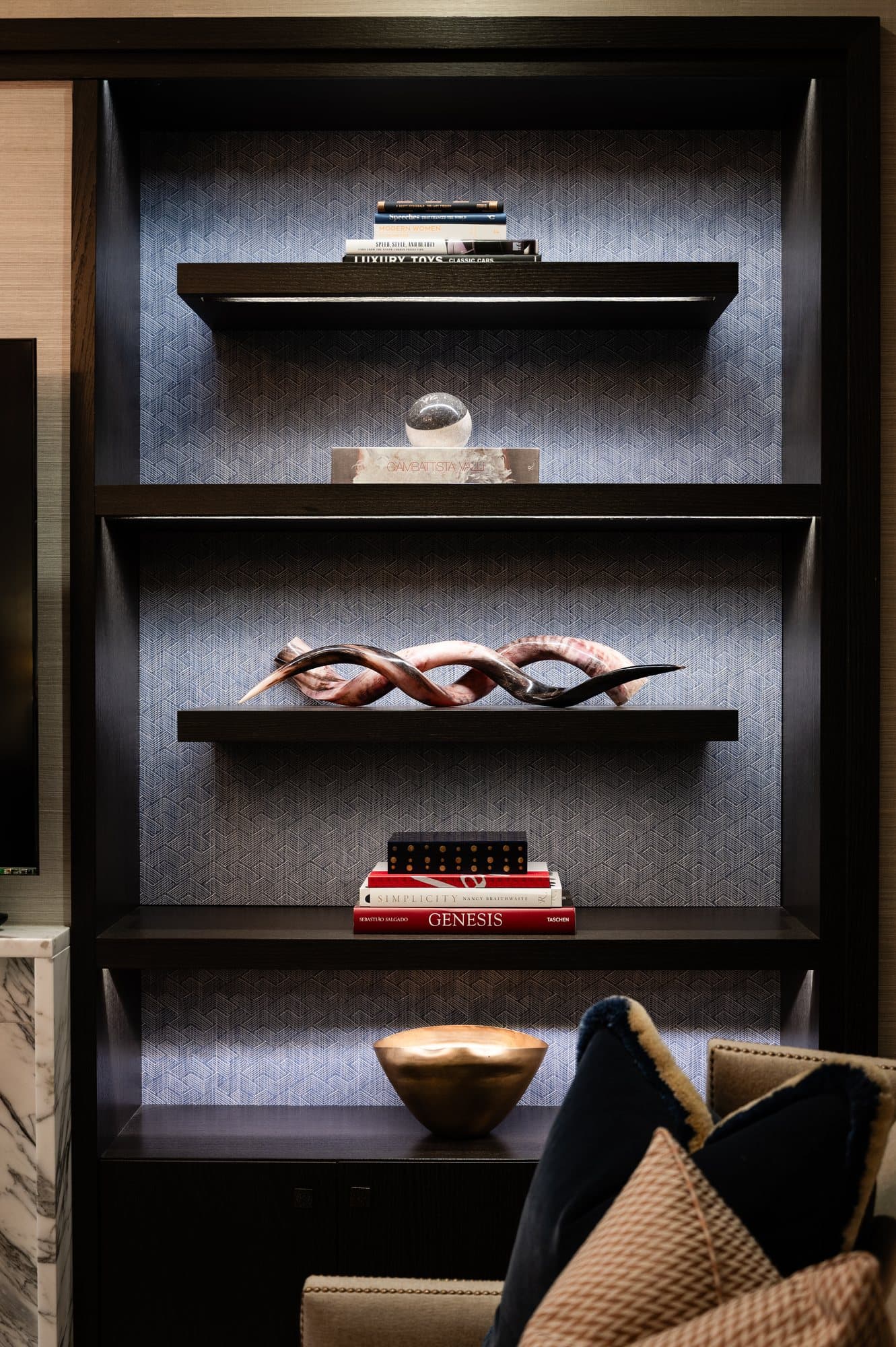
The room shown should look *inhabited but tidied*. Slight disarray on a coffee table. A book left open on the arm of a sofa. A throw across one chair. This is not staging — it is photographic permission for the buyer to picture themselves in the room.
2. The video is two minutes, not seven
Long walkthroughs lose people. Nobody watches seven minutes of a corridor. Structure: 8 seconds of exterior establishing, 90 seconds of interior, 20 seconds of view/setting, end on the hero composition. Cinematic colour grade, no narration, and music you have the rights to use.
3. Aerial work should show the *neighbourhood*, not the building
A common mistake: the aircraft hovers in front of the property and pans around. It looks like estate-agent aerial footage, because that is what it is. A more useful approach is to show the property *in its setting* — a slow rise from the street to roof line, then a 180° rotation to reveal the view the building has of the city. Now the buyer is buying a viewpoint, not a building.
4. Floor plans are an annotated brochure, not a survey
The floor plan that wins is the one with two paragraphs of architectural note alongside it. "Original 1882 sash windows retained throughout the principal floor." "South-facing aspect from the entire reception level." This costs nothing to add. Most agents don't.
The bigger pattern
Buyers are picturing themselves in the room. Photography that leaves space for that does more work than photography that simply records what is there.
None of the four is complicated. They are decisions, mostly, rather than budget.
“Buyers in this bracket are not comparing your listing to other listings. They are comparing it to the photography in the architecture magazine they read on Sunday.”
Continue reading